2.3.65 relative-frequency distribution
A simple quantitative data set has been provided. Use limit grouping with a first class of 0-4and a class width of 5 to complete parts (a) through (d) for this data set.
(a) Determine a frequency distribution.
First, we need to import the data from Excel. (For simplicity, this imports mannual by hand, we can get the same result by importing dataset from Excel)
data <- c(21, 6, 2, 4, 2, 23, 17, 9, 24, 12, 3, 22, 26, 28, 9, 18, 4, 27, 0, 26)
data
## [1] 21 6 2 4 2 23 17 9 24 12 3 22 26 28 9 18 4 27 0 26We can get the frequency by using table() command
table(data)## data
## 0 2 3 4 6 9 12 17 18 21 22 23 24 26 27 28
## 1 2 1 2 1 2 1 1 1 1 1 1 1 2 1 1To display bin frenquency table use as.data.frame() command
k = as.data.frame(table(cut(data, breaks=seq(0,30, by=5))))
k
## Var1 Freq
## 1 (0,5] 5
## 2 (5,10] 3
## 3 (10,15] 1
## 4 (15,20] 2
## 5 (20,25] 4
## 6 (25,30] 4Since R does not count the value 0, we could double check the value in range 0-4 and readjust the value
f = k$Freq
f
## [1] 5 3 1 2 4 4f[1] = 6
f## [1] 6 3 1 2 4 4
(b) Obtain a relative-frequency distribution.
To display relative frenquency table in column format use cbind() command
f/length(data)## [1] 0.30 0.15 0.05 0.10 0.20 0.20To display the result appropriate to 5 decimal places use print() command
In this case, we have nice results so it does not show the difference.
print(f/length(data), digits = 5)## [1] 0.30 0.15 0.05 0.10 0.20 0.20
(c) Construct a frequency histogram based on your result from part (a). Choose the correct histogram below.
Display bar chart using barplot() command
barplot(f)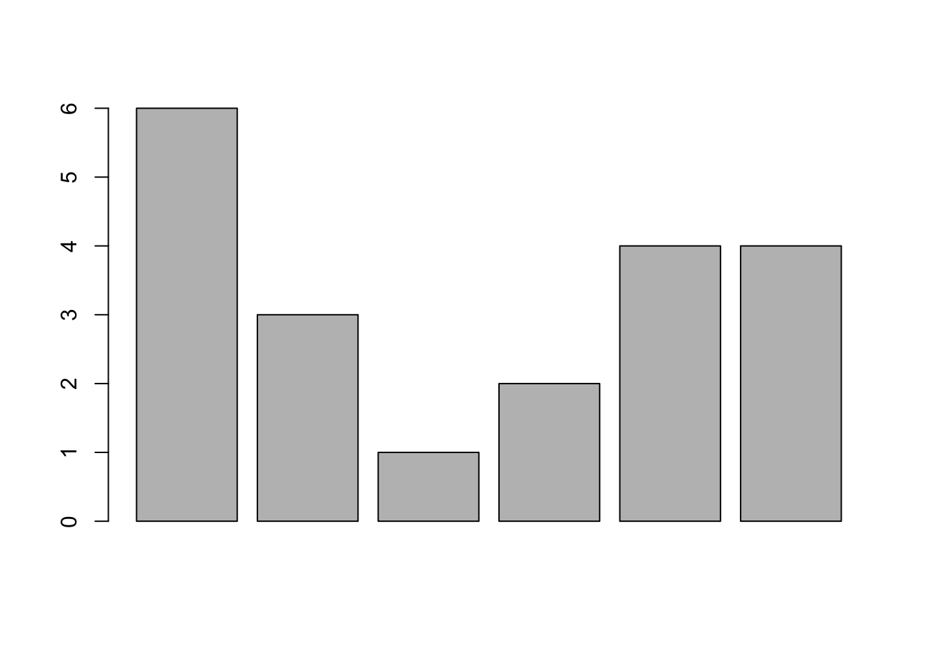

(d) Construct a relative-frequency histogram based on your result from part (b). Choose the correct histogram below.
The relative-frequency histogram should have the same behavior with the one in part (c). We can get histogram plot by using barplot() command
barplot(f/length(data))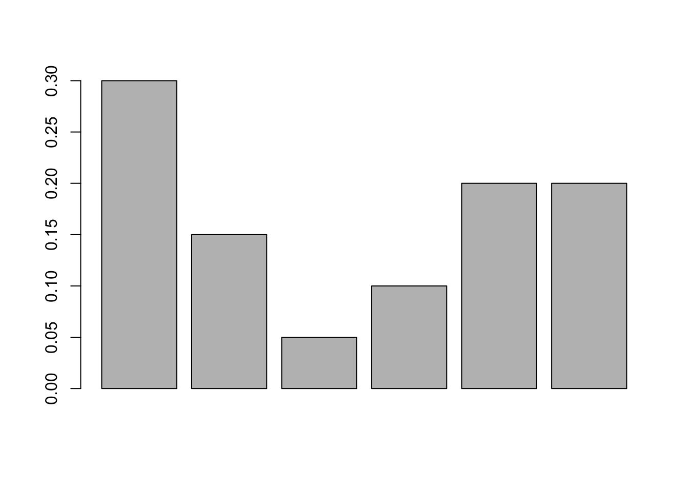

Hope that helps!